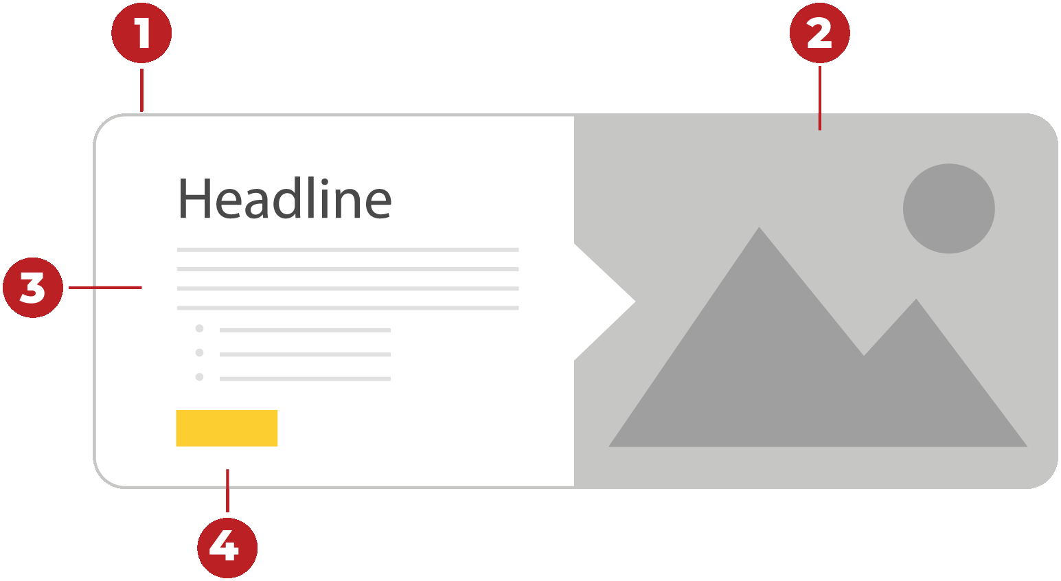
Image Card Component
The Image Card component features a large image with a bold headline, descriptive text, and a vibrant button link.
The design creates a personal touch that immediately helps build credibility and trust
with your audience. Having large high-quality imagery along with a short message can
help make a positive first impression.
Features:
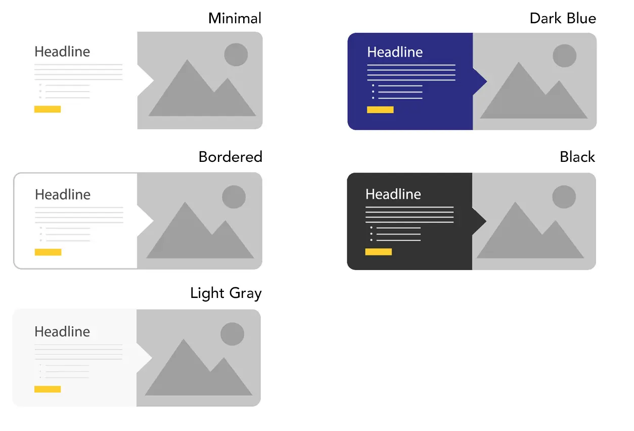
- Choose from five different design box styles to suit any campaign style.
- Large attention-grabbing images that will adapt to the screen sizes and draw in your
audience.
- Highly visible headlines with large description area.
- Strong call to action button link with optional font awesome icon.
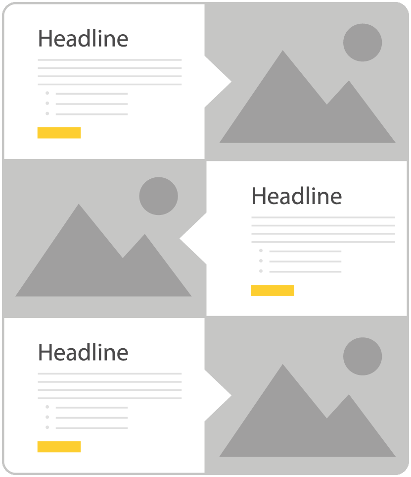
Designs:
When to use the Image Card component
Use this component to create a strong visual presence on a web page while direct users towards a desired link or call-to-action.
Use cases include promotional events, call-to-action items like registrations or applications, and informational highlights.
Usability guidance
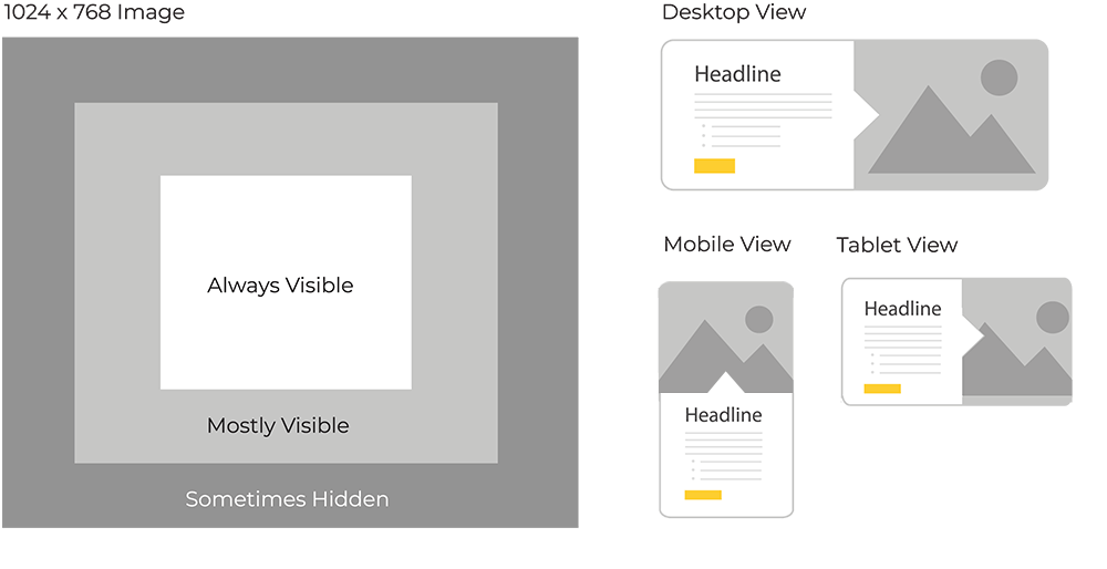
A minimum resolution of 1024 x 768 is recommended for the media image. Contact the web support team if you need help with image sizing.
Vertical Orientation Feature
When nested within a column snippet of size 6 or smaller, the Image Card seamlessly transitions to a vertical layout.
The image takes precedence, positioned above the text, creating a focused visual impact that adapts to various screen sizes.
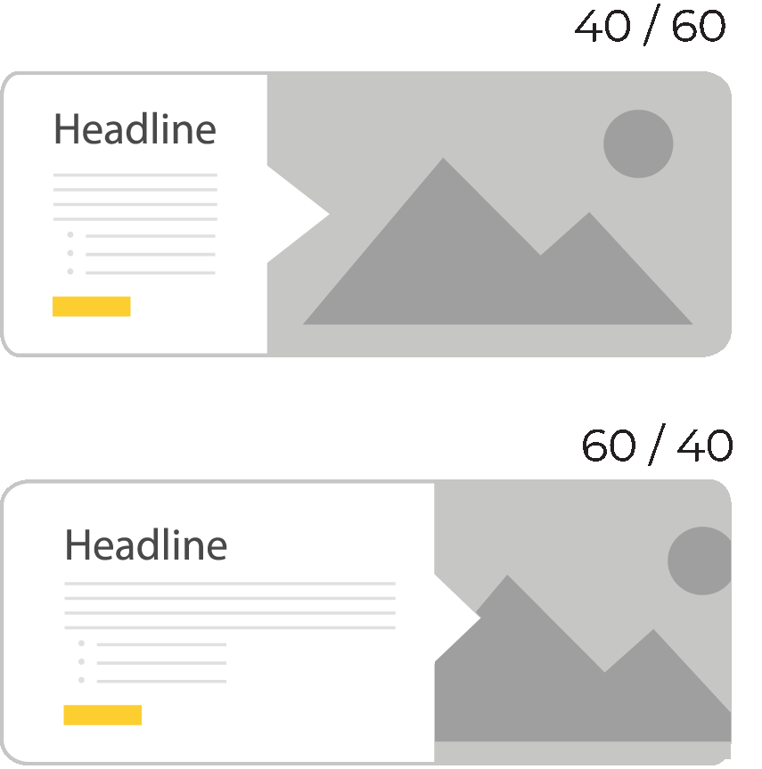
The design styles are fully compatible with the vertical layout format. You can also use the split width option to alter the size of the image and content areas.

Additional Options
Reverse Direction
Alternate the display direction on larger screens.

Adjust Split Widths
Group Styling
Stacking multiple instances of the component will enable a group styling effect.
YouTube Lightbox
Using a Youtube URL for the hyperlink will enable a clickable video icon overlaid onto the image. When clicked, the video will open in a lightbox-style window.

Images
An image with a minimum resolution of 1024 x 768 is recommended for the best visual display.
Do not use imagery that includes instructional text, as some screen sizes, like tablets in portrait mode, may show less of the overall picture.
Keep the main subject in the center of the image to be visible on all screen sizes.
Implementation
- Open a page in Modern Campus CMS and enter editing mode.
- Place your cursor where you would like to place an image.
- From the toolbar, select the component icon
 , which resembles an atom symbol.
 - From the list of components, select the Image Card component.
- Fill in the required fields and select your options.
- Save and preview.
Live Example
Headline
- item one
- item two
- item three
- item four
View all live design examples
