Compact Image Card Component
The Compact Image Card Component creates a linked image block with text overlaid on top, offering flexible display options for various layouts and purposes.
When to Use the Compact Image Card Component
This component is ideal for creating visually engaging calls-to-action that combine compelling imagery with concise text. It can be used within column snippets or float box snippets to create dynamic layouts and grid displays.
Features and Options
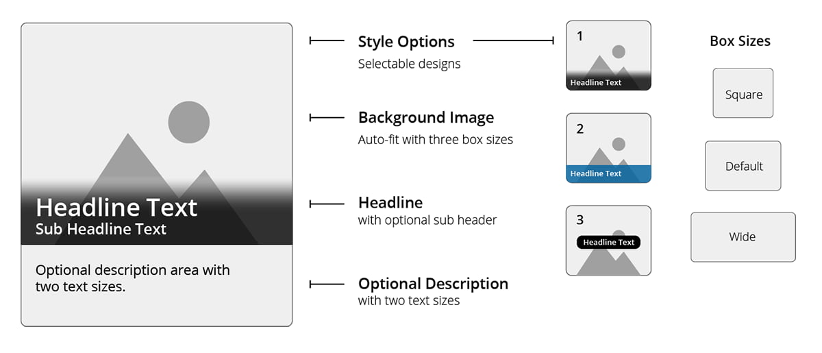
- Display Styles: Users can choose from three display styles to suit their design needs.
- Box Sizes: Three box size options are available to accommodate various use cases and image display sizes.
- Image Adjustments: Images auto-fit to the selected box size, with additional options for alignment and filters to enhance presentation.
- Grid Displays: Combine with the column snippet to create attractive grid-style arrangements.
Usability Guidance
Image Size Recommendations:
An image is required for this component. Each image will auto-fit the selected box size.
However, for optimal image display, use the following dimensions based on the box size:
- Default Size: 800 x 500
- Square Size: 800 x 630
- Wide Size: 800 x 290
Images exceeding 1000 pixels in width or height will be automatically resized.
Linking: Each component must link to a page or file and should not serve as decorative-only content.
Text Length: Keep the title and subtitle concise.
Display Options using Snippets:
Three Column Snippet:
Two Column Snippet with square and wide box sizes:
Image Filters
Optional filters applied to the background image:
Box size wide, text centered, with Blur filter
Implementation
- Open a page in Modern Campus CMS and enter editing mode.
- Place your cursor where you would like to place an image.
- From the toolbar, select the component icon
 , which resembles an atom symbol.
 - From the list of components, select the Compact Image Card component.
- Fill in the required fields and select your options.
- Save and preview.
